Wedding Websites · · 1 min read
A Readability Check for Wedding Websites Shared With Elders
Readable invitation design uses clear text, predictable buttons and enough contrast. Ask an older relative to try the page on their own phone, because familiarity with your design can hide problems from you.
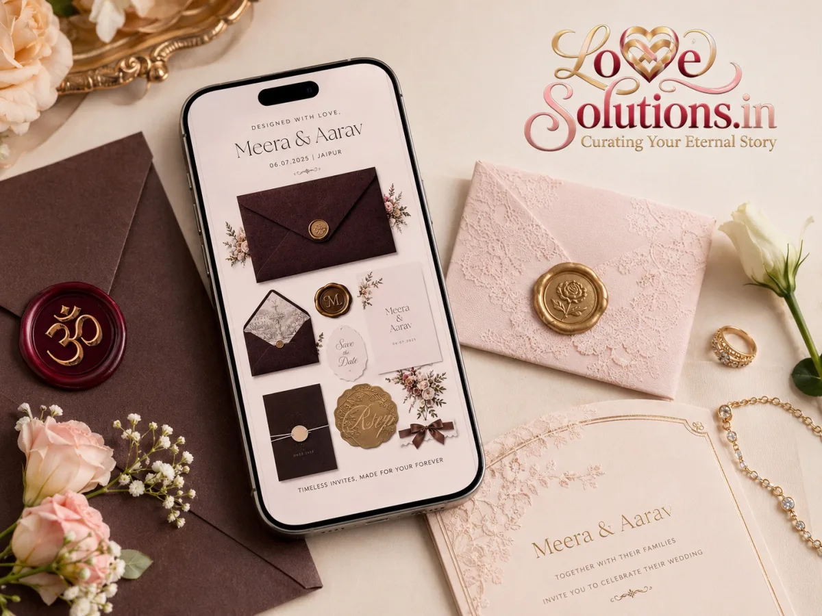
Begin with the essential details
Keep decorative script for short names or accents and use a plain typeface for dates, times and addresses. Avoid pale text over busy photos. Write the month in words and include the weekday only after checking that it matches the date.
Make actions obvious
Use labels such as “Open venue map” and “Confirm attendance” instead of an unexplained icon. Ensure buttons have enough space around them so a guest can tap one without opening another. Keep phone contact information available for anyone who would rather call than use a form.
Ask the guest to demonstrate
Have your tester find the reception time, enlarge text and open the map. Do not take the phone from them at the first pause; note the obstacle and fix it. Check again after changes. If the family prefers printed cards, provide a matching simple version with the same facts rather than expecting every guest to adopt the website.