Wedding Website · · 1 min read
Two Functions Needed Two Clearly Named Map Buttons
An illustrative planning story about a wedding ceremony and reception at different venues. It is a fictional example of improving the guest journey.
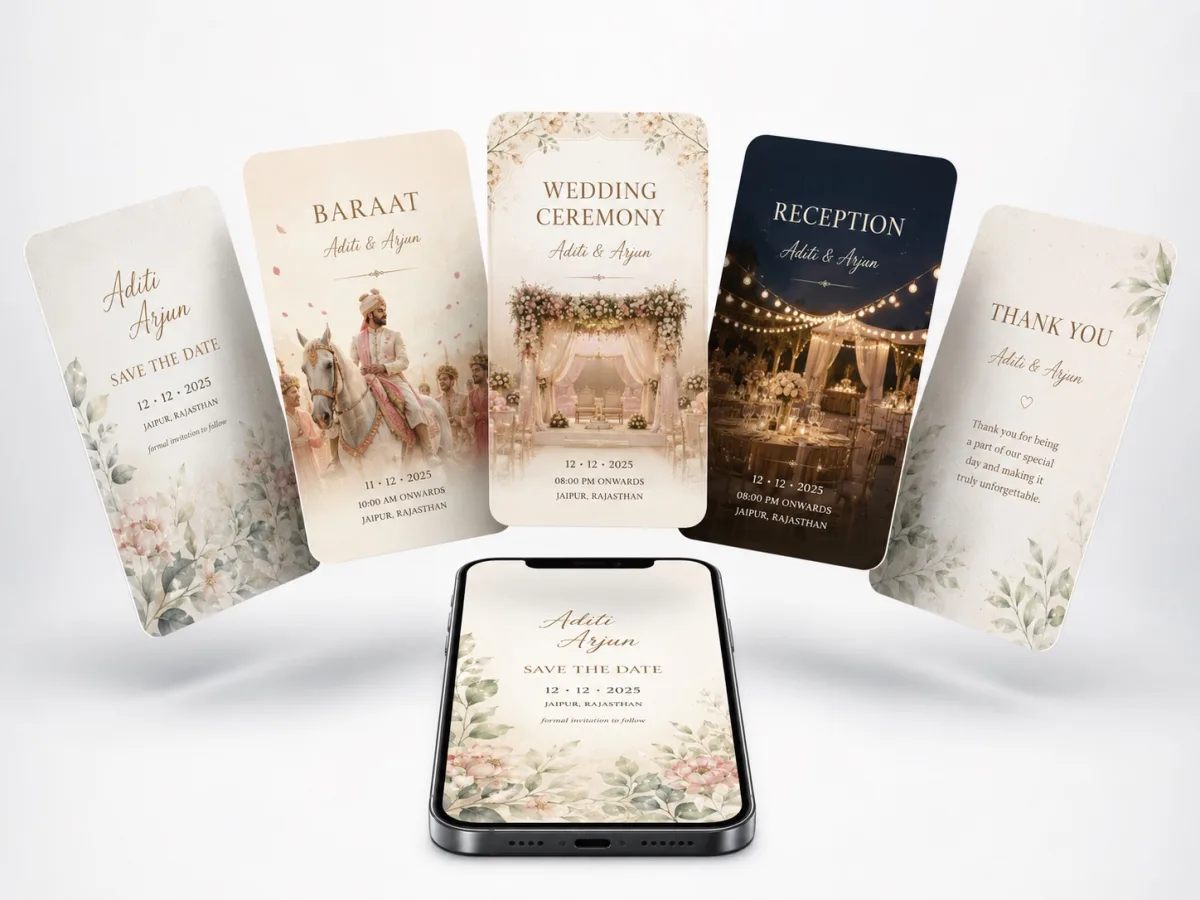
The situation
A website displays two beautiful event cards but places a single “Location” button beneath them. The button points to the ceremony venue. A guest invited only to the reception could reasonably assume that it also provides their directions.
The planning decision
Each event receives its own arrival time, complete address and explicitly named map action. The reception message links to the appropriate event details, while the schedule explains the transfer only for guests attending both functions.
The useful detail
The host confirms whether transport is provided before adding a shuttle note. A helper unfamiliar with the plan is asked where they would go for each event and how they would get there. The calendar entries and PDF are checked against the same approved sequence.
What to borrow
Attach directions to the event they serve instead of making guests infer the relationship from page layout. Separate an invitation to two events from a promise of transport between them. In this scenario, clearer labelling would remove an obvious ambiguity; the host still needs to verify each real venue pin and confirm the travel arrangements.