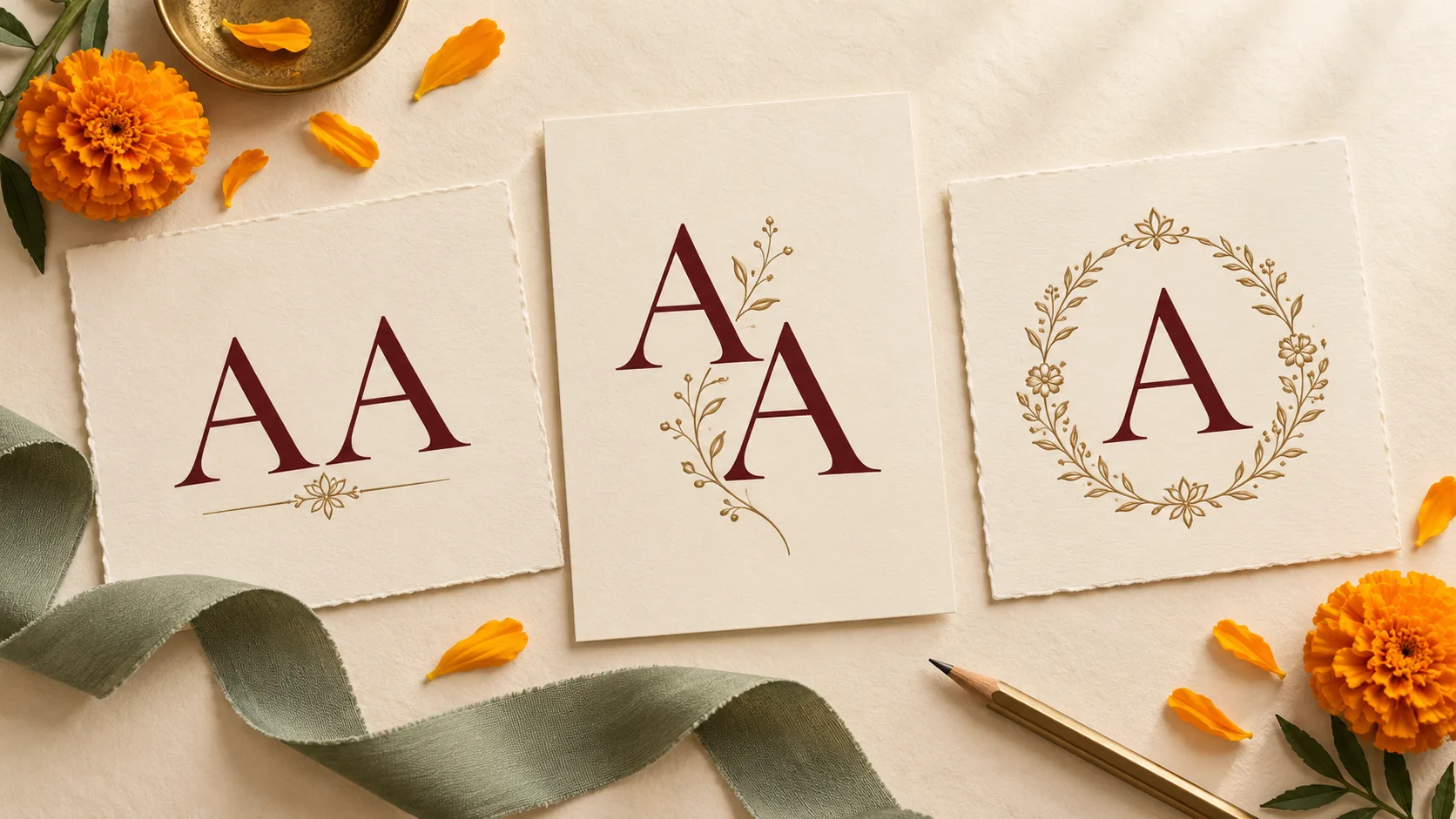
Aditi and Arjun. Sana and Sahil. Leena and Laksh. Two names can begin with the same letter and still make a lovely wedding monogram. The design needs to make a few choices clear: whether guests should see two initials or one shared emblem, how the letters sit together, and where the full names belong.
Start with three simple arrangements in one colour: two separated initials, a carefully overlapped pair and a single shared initial with the names below. Compare them at the smallest size you expect to use. This gives you a useful starting point before adding flowers, borders or metallic effects.
The names and design situations in this guide are fictional examples. Use them to brief your designer and judge your own initials with fresh eyes.
Decide what the repeated letter should communicate
A same-initial wedding logo can show two people through two visible letters, or use one letter as a shared symbol. Both approaches can work. Agree on the intention together before judging the artwork.
Write down the exact names you want guests to see, including their preferred spellings and order. Decide whether the emblem uses first-name initials, surname initials or another meaningful arrangement. A shared first letter does not require either partner to change their name.
If the artwork contains two letters, each should remain identifiable in the versions intended to be read that way. If you deliberately choose one shared letter, let the surrounding names introduce the couple.
Compare four labelled monogram options
Keep the labels on your review sheet so feedback refers to a specific arrangement. These are design directions to explore, rather than finished logos to copy.
Option A: Separated initials with an ampersand
For fictional Aditi and Arjun, A & A gives each name its own place. Start with the same letter style and comparable visual weight. Make the ampersand clearly smaller if you want the initials to lead.
Check the spaces on both sides of the ampersand. A flourish that almost touches an A can make the centre look crowded even when the outer margins feel generous.
This is a useful first comparison when you want guests to read two initials immediately. Try it without a frame before deciding whether the design needs one.
Option B: An offset double initial
For fictional Sana and Sahil, place two upright S forms slightly apart diagonally. The offset can create movement while leaving enough of each letter visible to recognise it.
Review the overlap in a single solid colour. If one S becomes a shadow or the pair resembles a different character, open the space between them or reduce the overlap. Colour can enrich the design, but the arrangement should also make sense when colour differences disappear.
Keep the two forms similarly prominent unless you both want an intentionally asymmetric composition.
Option C: One shared initial with both names
For fictional Leena and Laksh, a single L can sit above a readable “Leena & Laksh” line. The L becomes their shared emblem, while the names explain it.
This approach can keep the central shape simple. Its success depends on context: a standalone L on an unfamiliar envelope provides much less information than the same L above the couple's names on an invitation.
Discuss where the emblem may appear alone and where the full-name version is needed. Keep the names large enough to read wherever they are included.
Option D: Two initials in a divided frame
For fictional Kavya and Kunal, two K initials can occupy separate halves of an oval or a simple rectangular frame. A gap or a restrained dividing line gives each letter its own space.
Check that the divider stays visually quieter than the letters. If the frame and divider make the small version busy, compare a frame-free pair for compact uses.
Avoid automatically flipping one K to create symmetry. Ask whether the reversed character still reads as intended and whether both partners like that treatment.
Give the initials and names a clear hierarchy
Hierarchy is the order in which you notice the parts of the design. On a monogram-led invitation cover, the initials might come first, the names second and the date third. On a welcome board, the full names may need to be the most prominent element.
Review those actual layouts before selecting a favourite. A large decorative emblem can leave too little room for names when placed at the top of a narrow menu.
Equal importance also needs a visual check. Two letters set to the same size can appear unequal when one has long flourishes or a heavier stroke. Ask whether either initial looks dominant, hidden or added as an afterthought.
A useful first pass keeps both initials in the same lettering style. If you want two different styles, compare their darkness, width and decorative reach. Give each partner a clear presence without making every element compete for attention.
Check three different kinds of space
The gaps deserve as much attention as the letter shapes.
Space within each letter. Look at the opening inside an A, the loops of an S or the bowl of a P. Overlap and ornament can close these spaces and make familiar letters harder to recognise.
Space between the initials. Ask the designer to show a close, medium and open arrangement at the same overall scale. Compare how readily you see the intended letters in each. Adobe's explanation of kerning and tracking distinguishes adjustments between individual letter pairs from spacing across a longer run of text. For your review, the practical question is simple: does this particular pair look balanced?
Space around the whole emblem. Keep surrounding flowers, borders and wording far enough away to preserve the shape. Ask to see the monogram inside the real invitation layout, where neighbouring content can crowd it.
There is no single gap measurement that suits every letter style and application. Judge the visible space at the size guests will encounter.
Keep the full names available
An initial is an abbreviation. Even a beautifully drawn pair cannot tell an unfamiliar reader exactly whose wedding it represents.
Use the full names clearly on the invitation and welcome material, whether they are attached to the emblem or positioned elsewhere in the layout. Small favour tags can use a compact mark when the surrounding wedding context already identifies the couple.
If you are including another writing system, confirm the preferred name spellings with someone who reads it fluently. Two names with the same English initial may begin differently in another script. Review each version on its own terms and avoid distorting characters simply to match the English emblem's shape.
Test the design in the places it will actually appear
A large preview is helpful for seeing detail. Add a small-use review before approving the direction.
- Print the intended size. If a tag will carry a monogram about 20 mm wide, print it at that width. This is an example test size, not a universal minimum. Check the actual emblem width rather than the tag's overall dimensions.
- View it on a phone. Put the monogram in a sample invitation image or page header at the planned display size. Review without zooming. Check any circular crop if you intend to use it as a group image.
- Remove colour as a clue. Compare a single-colour version. Confirm that the repeated letters remain understandable and that an overlap has not become one dense patch.
- Ask a fresh reader. Briefly show the artwork to someone who has not followed the design process. Ask, “What letters do you see?” Record their answer before explaining the idea.
- Check the intended material. For a stamp, foil detail or embroidered item, ask the supplier whether the fine strokes and gaps can reproduce at the proposed size. A paper printout cannot establish that.
If a test fails, change one thing at a time: reduce overlap, simplify a flourish, adjust spacing or remove the frame. Repeat the same test so you can see whether the change helped.
Label the versions by their purpose
Once you choose a direction, ask whether the project needs two related arrangements:
- Full-name version: emblem with readable names, for the invitation opening or welcome material
- Compact version: simplified emblem for places where the names already appear nearby or the wedding context is clear
These labels describe how the design is used. Agree any extra versions with the designer as part of the project scope.
For Aditi and Arjun's fictional design, Option A could work on both pieces. The full version pairs A & A with their names; the compact version keeps the same letter shapes and spacing without the name line. They can compare both together to check that each still feels like the same wedding.
Your same-initial monogram review checklist
Before choosing the design, check:
- Both partners approve the initials, names, spellings and order
- The design deliberately shows two initials or one shared emblem
- Each intended letter can be recognised without an explanation
- Neither partner's initial feels accidentally hidden or secondary
- Internal openings and overlaps remain clear at small sizes
- Names are readable wherever they are included
- The design works in one colour and against the intended backgrounds
- Compact and full-name arrangements feel related
- Specialist suppliers have assessed any relevant material limitations
Common questions
Do two identical initials have to overlap?
No. Side-by-side letters, an ampersand arrangement or a divided frame can keep them separate. Compare these with an overlapping option before deciding.
Can we use one shared first initial?
Yes, if you both like that approach. Make the couple's full names clear on the main invitation and other introductory material.
Should we add a surname to make the letters different?
Only if that choice reflects the names you want to use. Try spacing and layout changes first; avoid adding a surname solely to repair a crowded design.
Bring your initials and planned uses to the brief
Love Solutions offers wedding branding, couple logos and stationery. Share your exact names, preferred visual direction and smallest planned use when discussing the project. A clear brief gives the repeated letter room to become a recognisable part of your celebration.